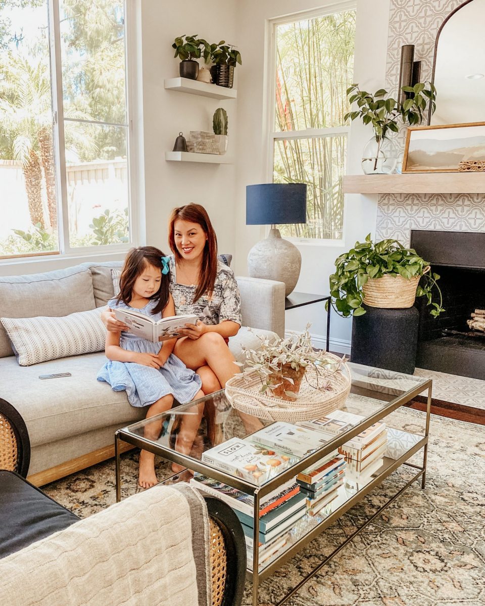
Amongst parents, the main topic of conversation during the last few weeks has been whether or not their kids are going to school on-site or online. In our community, it sounds like most kids are sticking it out at home for socially-distant learning. So is the case for all three of my girls—but that doesn’t mean it was an easy decision to make.
Of all my girls, Natalie has been the most impacted by COVID-19. She’s 6 years old, a critical age for establishing core social skills. Developmentally speaking, she needs outside structure and socialization. While I can do my best to make sure she has a reliable routine and is spending quality time with her sisters, this is nothing compared to the benefits of being in a classroom surrounded by kids her age!
Of course, in Covid Era, that’s exactly what we have to avoid.
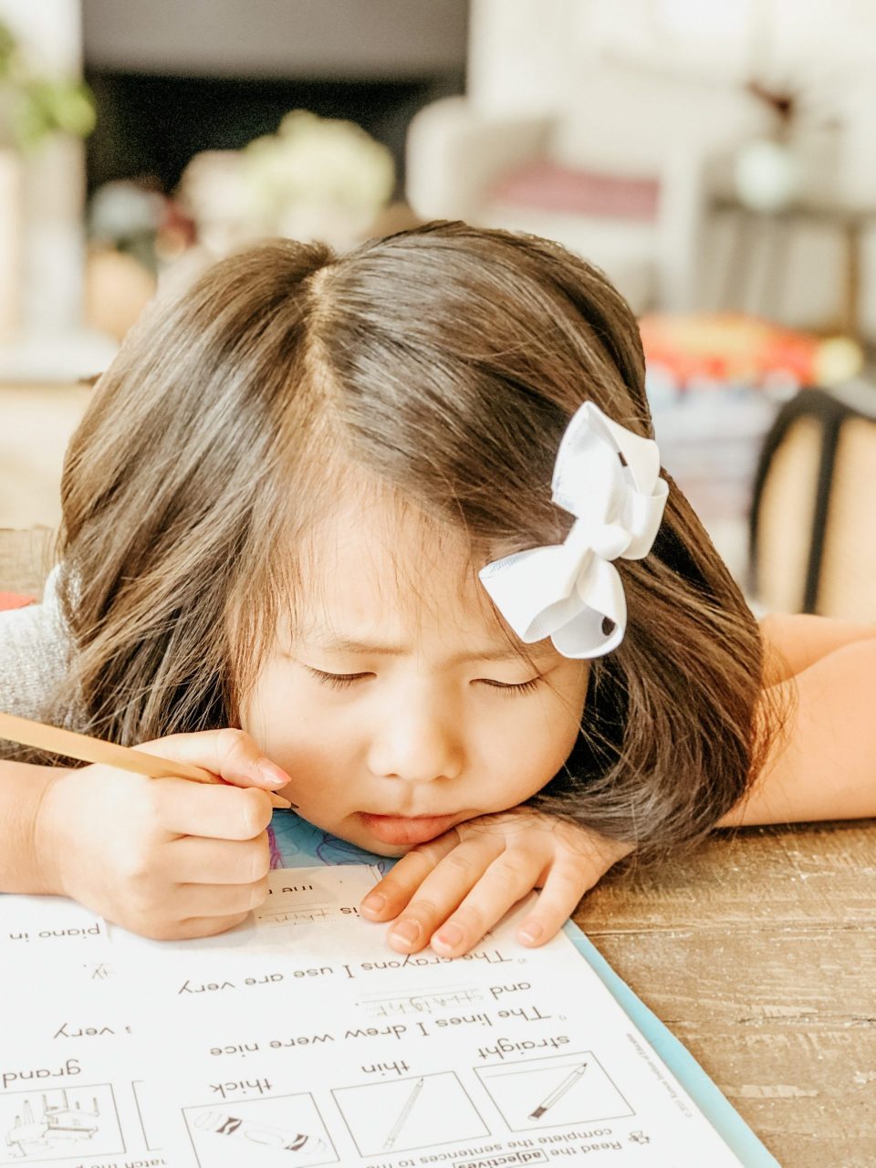
Initially, when the school district approved elementary kids to attend school five days a week, I was elated! But the very next day, the number of COVID-19 cases spiked. California’s governor said if the numbers don’t improve in two weeks, schools cannot reopen safely.
I was utterly disappointed and felt a bit hopeless. I really thought by early Fall, we would be slowly returning to Phase 2, at the very least. Especially because Orange County had been so great about social distancing, and our numbers had been low before the surge.
Now, that is NOT the case. So I am finding myself in yet another new normal. Usually, we are busy getting ready to buy new clothes and shoes for the growing girls, and picking out new backpacks and supplies for the upcoming school year. But it all seems moot. This is not the year I wanted, but it’s the year we all got.
I realize that my attitude sets the tone for my girls. Kids are such sponges! Even when they’re no longer repeating our actions and phrases, they’re still absorbing so much from how we approach different situations. I want to have a more positive mindset so that the girls will feel positive about the new school year, too!

I want my girls to feel excited about the year ahead, just as they would normally. All that momentum helps them to pay better attention in class, and apply themselves to their school work! If school already feels like a chore, it’ll be harder to get them to really engage—let alone try their best!
With this intention at heart, here are a few things I’m implementing at home to help the kids transition back to school:
Rewinding Bedtime
With these long days and warm nights, we have been going to bed later in the summer. But school is starting soon, and we have to get our act together! We’re calculating bedtime backwards from our new morning wake-up call at 7:00am, giving them a little more than an hour to get ready and have breakfast before starting virtual school at 8:30am.
Academic success starts with sleep, and kids need tons of it. Sleep is especially important for storing what they’ve learned, and without a minimum of 8 hours, their ability to concentrate on new information begins to decline. Which puts bedtime firmly at 9:00pm.

Natalie in particular has had a really difficult time sleeping since Covid started. I think her anxieties and ambivalence about all this unpredictability have been concentrated in her sleep patterns. She feels insecure at night and can’t fall asleep, whereas before we had never had a problem! Getting her on a consistent schedule is going to be an imperative.
Rather than dive in the day before school with a fresh set of rules (a surefire way to spark a mutiny), we’re easing gently into a new schedule. We’ll start by adjusting dinner time—and they won’t even notice! From there, we’ll remove devices before bed and generally start winding down earlier. The light and noise level will come down around the house, so sleep will feel like a natural next step!
We’ll implement each step over the next two weeks, so by the time school starts we’ll already be well within the bedtime ballpark when I casually suggest everyone gets a good night of sleep before the big day. Muahahah! My kids are frogs in water and they can’t even feel the temperature rising!
Rise & Shine!
Getting to bed is only half the work. Having a morning routine is equally important, and sets the tone for the day. To get the ball rolling smoothly requires open communication, clear expectations, and some reliable structure.
In my blog post on transitioning kids to a summer schedule, I talked a bit about how a schedule helps to reduce anxiety by providing predictability, which is emotionally anchoring for children. Many of the strategies we used there we can use here too! The core goals are super similar: we’re taking an intentional approach to transition—but now we’re getting them BACK to school.

I have been doing the same essential routine via graphics since Rachel, my first born, was 2. She wasn’t able to read yet, but understood basic Clip-Art style pictures of getting up, brushing teeth etc. That was 12 years ago! The routine has become steadily more sophisticated as she’s grown up, and we’re ready to hit the next step.
Now that the girls are older, they don’t need a lot of hand-holding to know how to get themselves ready for the day—although I do get my fair share of “Mom have you seen my…” More than anything, they need a common goal, clear expectations, and opportunities to test their skills for themselves.
While in Seattle, Trav and I introduced the older two girls, now 11 and 14, to Trello, our favorite project management tool, which we’ve co-opted into our modern day chore wheel. The girls have daily requirements, like chores and exercise, laid out in checkable lists! They have to finish their To Dos in order to earn Device Time for the next day.
As our girls continue to grow, we can add the Trello App to their phones, so they have easy-access to their lists, and we can keep expectations clear on how they can contribute to the household. Forward thinking! Whether it is a simple graphic chart or full on project management, it’s important to create some structure kids can depend on!
Setting the Stage
While evenings and mornings need structure and routine regardless of a pandemic, online learning presents it’s own set of challenges. Truthfully, your kids’ virtual education is not unlike adults’ WFH situation! Kids need the home environment to be calm and structured to be set up for success, just as we do while making it work from the kitchen table while our partner takes calls in the closet.
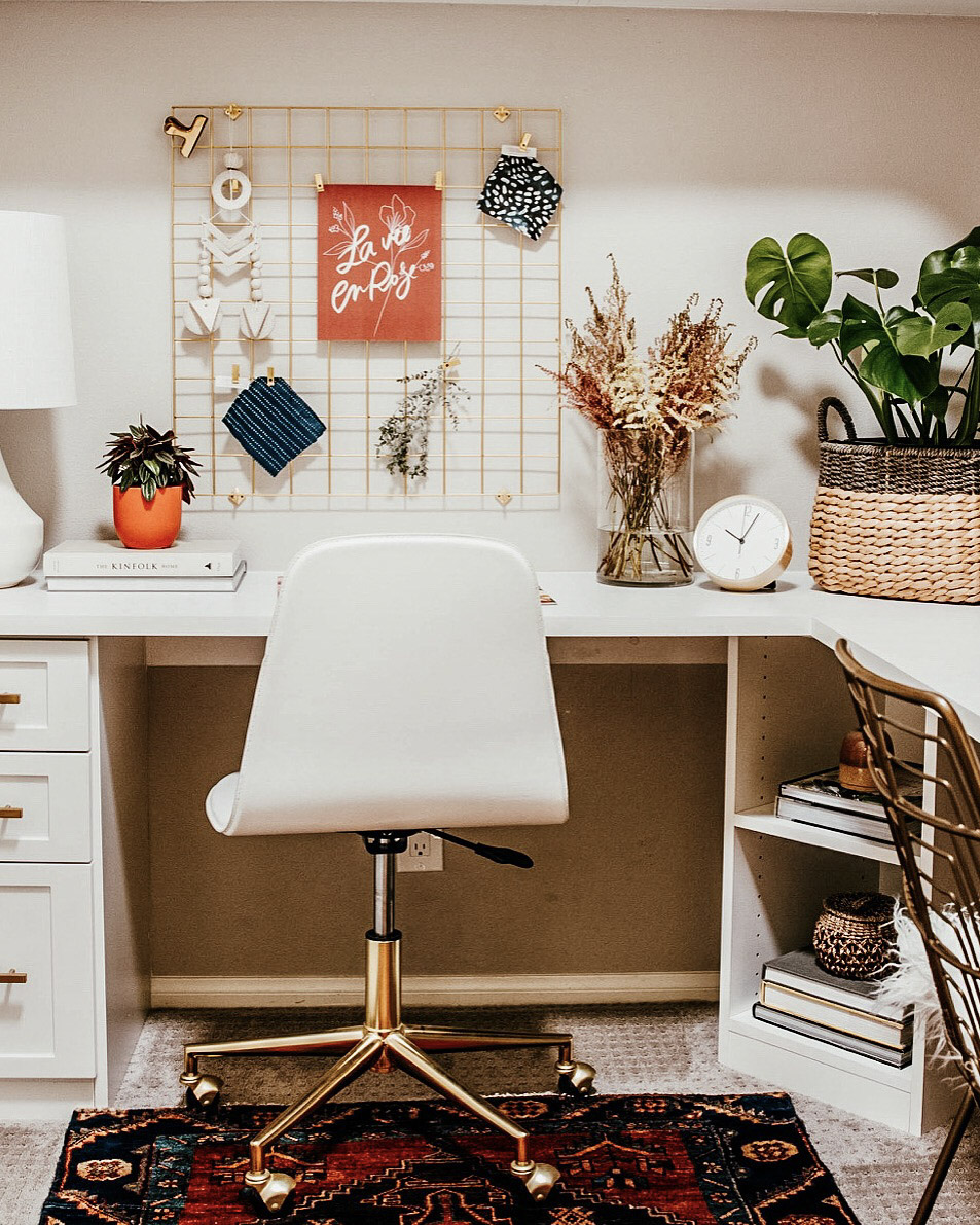
Whatever space you’re able to co-opt for your makeshift classroom, try to create three specific areas to accommodate the different types of learning your child will be doing! These don’t all need to be in the same area of your house, so find a balance that’s right for your home. Aim for:
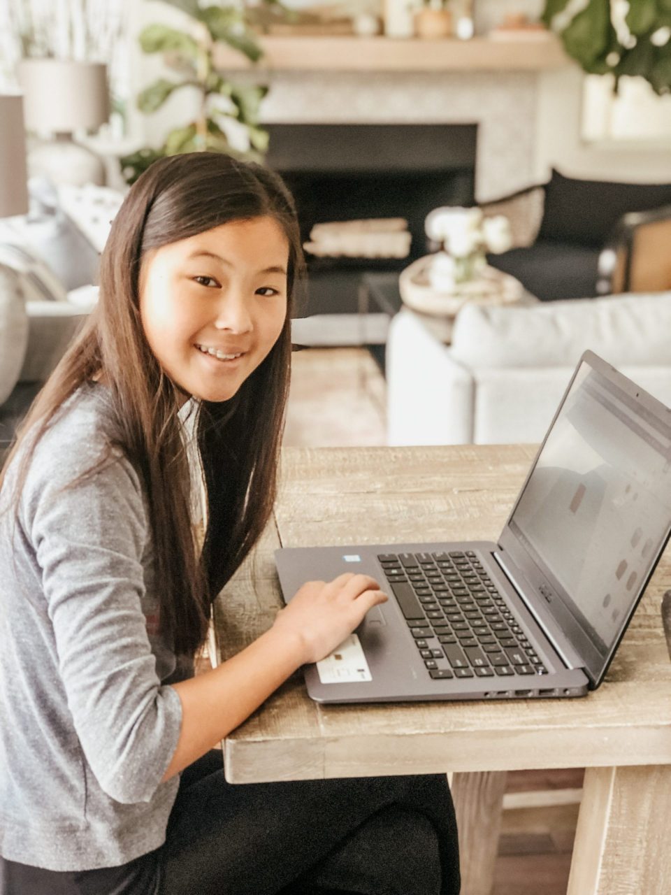
1. Standard Seated Workspace: this spot should be clean and clear. Take any items off the table your child is working at, and give them space to focus!
2. A Cozy Study Space: create a reading nook that invites reading! You can even pile a bunch of pillows and blankets in the corner for a little nest that reframes at-home learning to seem comfortable and warm.
3. Open Space to Sprawl: This is for crafts and school projects, and things that might take up more room—and more time to clean up, so it shouldn’t be the spot you eat dinner! Wherever you set this space, expect that it will get messy, and that it might stay messy overnight.
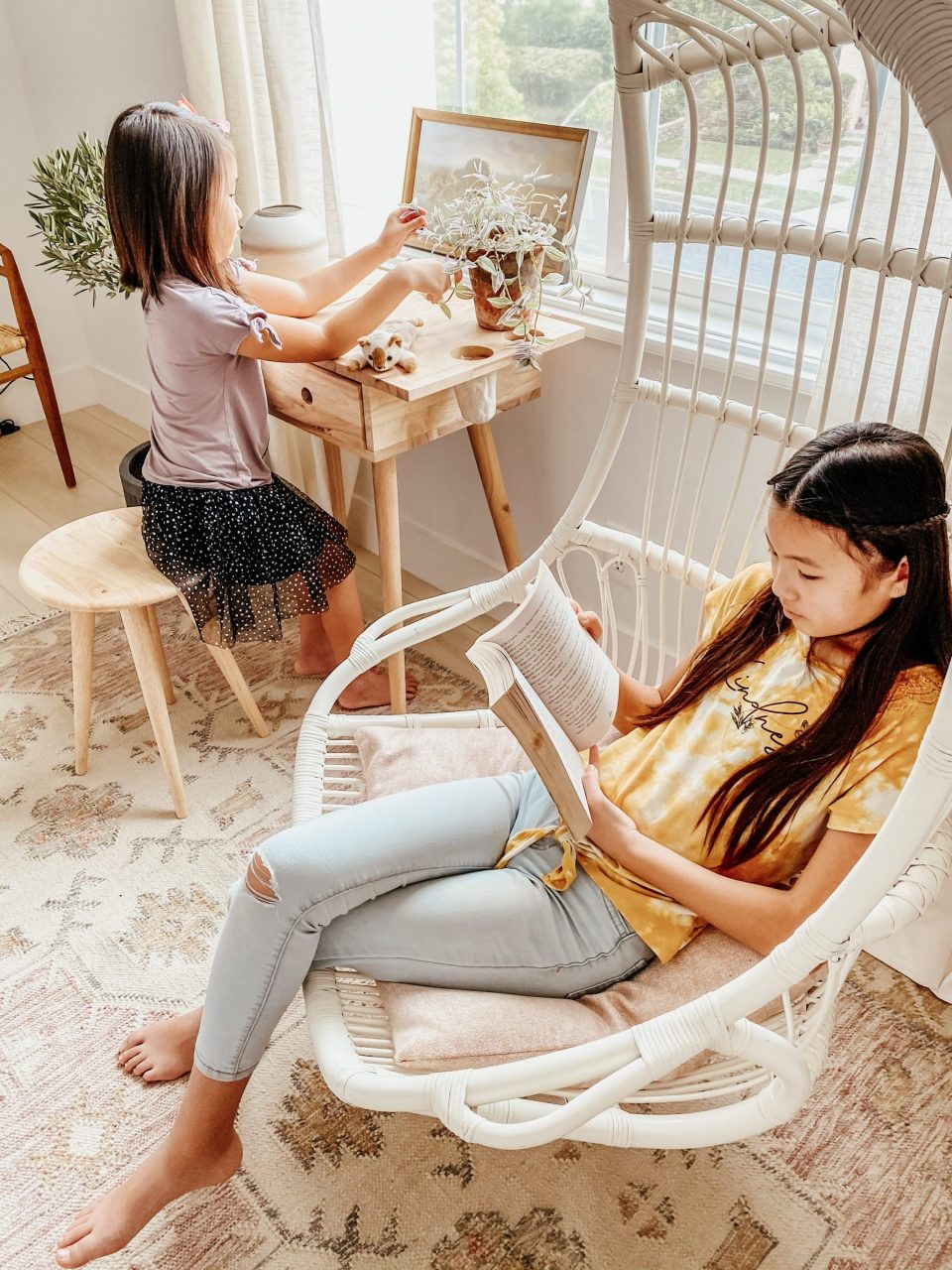
By offering multiple types of spaces for your kids to work, you help them to create their own inner sense of routine and autonomy. Being able to change the scenery can help set a clear intention for the task at hand—whether that be to promote focus, reduce stress, or inspire creativity.
Keep Communication Lines Open
I’ve said it before—I am a huge proponent of weekly Family Meetings! Ours are on Sunday at 4:00pm, and they always turn into card games and board game sessions. I like to think of them like mini board meetings with a big dose of empathy and fun!
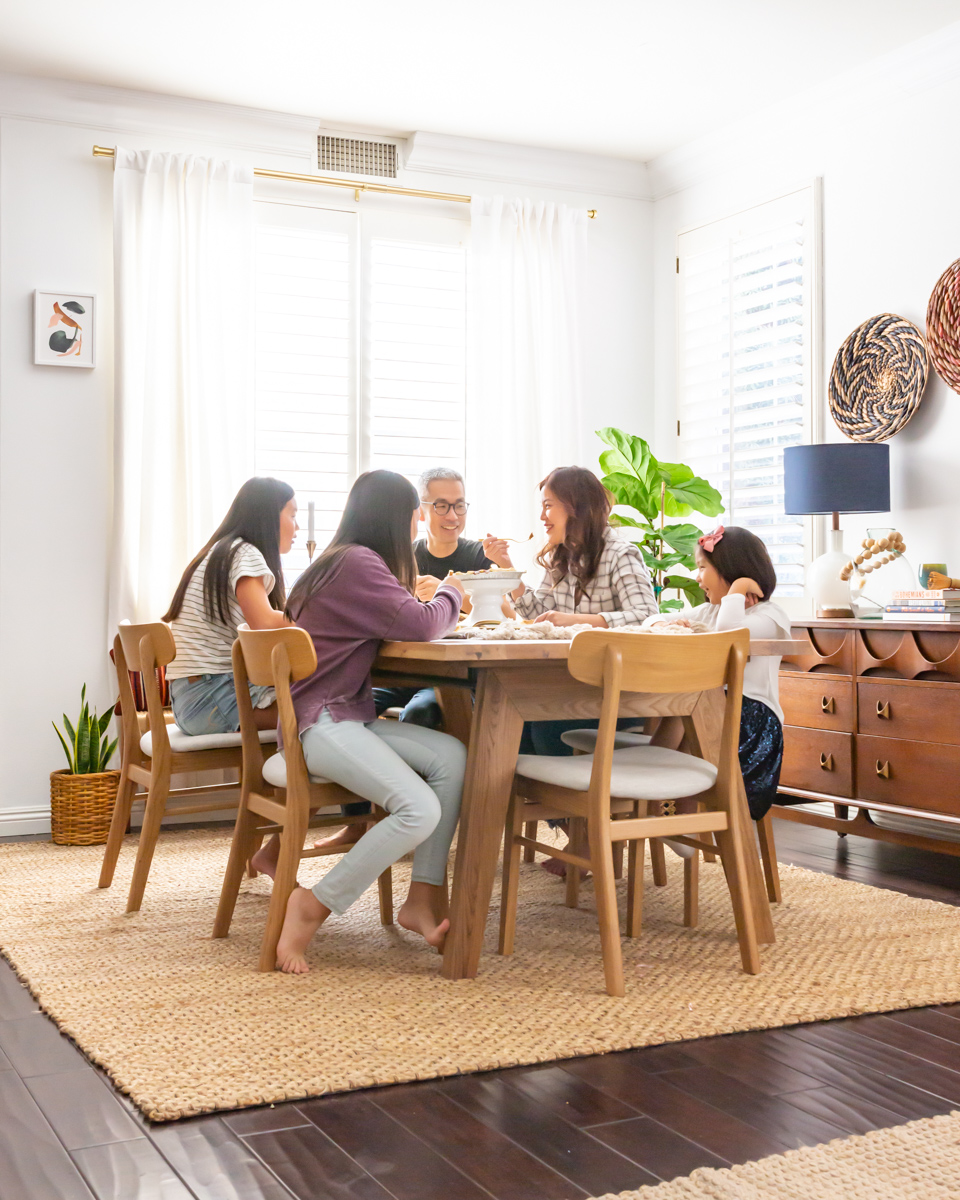
When I was a therapist, I always, and I mean always encouraged partners and families to hold meetings consistently. They’re so important to building trust and mutual respect for one another! In these family meetings, it’s important to reflect on the past week, how things could improve, and how where you can support each other more.
These gatherings give the whole family some quality time to look forward to, where everybody knows it’s a safe and fair platform to voice their opinion, negotiate responsibilities (and rewards), and gain empathy and support when they need it.
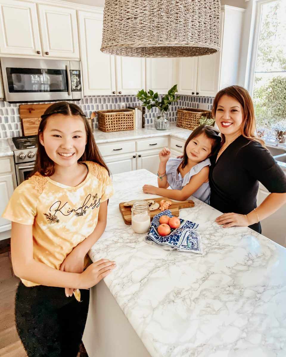
Even though in Covid Era it feels like we see one another all the time, they’re actually more important than ever! As life feels more mundane, it can be easy to miss the little moments in one another’s lives, and we might find ourselves increasingly isolated from even the people we’re physically closest to.
That’s why it’s important to reflect how WFH and online education has been in the past week. Start with meaningful questions that work harder to spark introspection than “How was your day?” Instead, Try:
- How do you like your teacher?
- What surprised you this week?
- Is there a subject you’re excited to explore deeper?
- What’s the hardest thing about online school?
- How are you finding new ways to connect with your classmates?
- Did you meet the goals you set for yourself this week?
- What are your goals for the week ahead?
You might be surprised where the conversation takes you!

+ show Comments
- Hide Comments
add a comment